
The Prism is a new concept brand for essential oils. Prism Essential oils are focused on the essence that is extracted, creating flavours, aromas and a mood altering experience.
The brands visual identity of the prism extracting light into a spectrum is a metaphor for the process that creates the essential oils, extracting a spectrum of colours, aromas, flavours and moods.

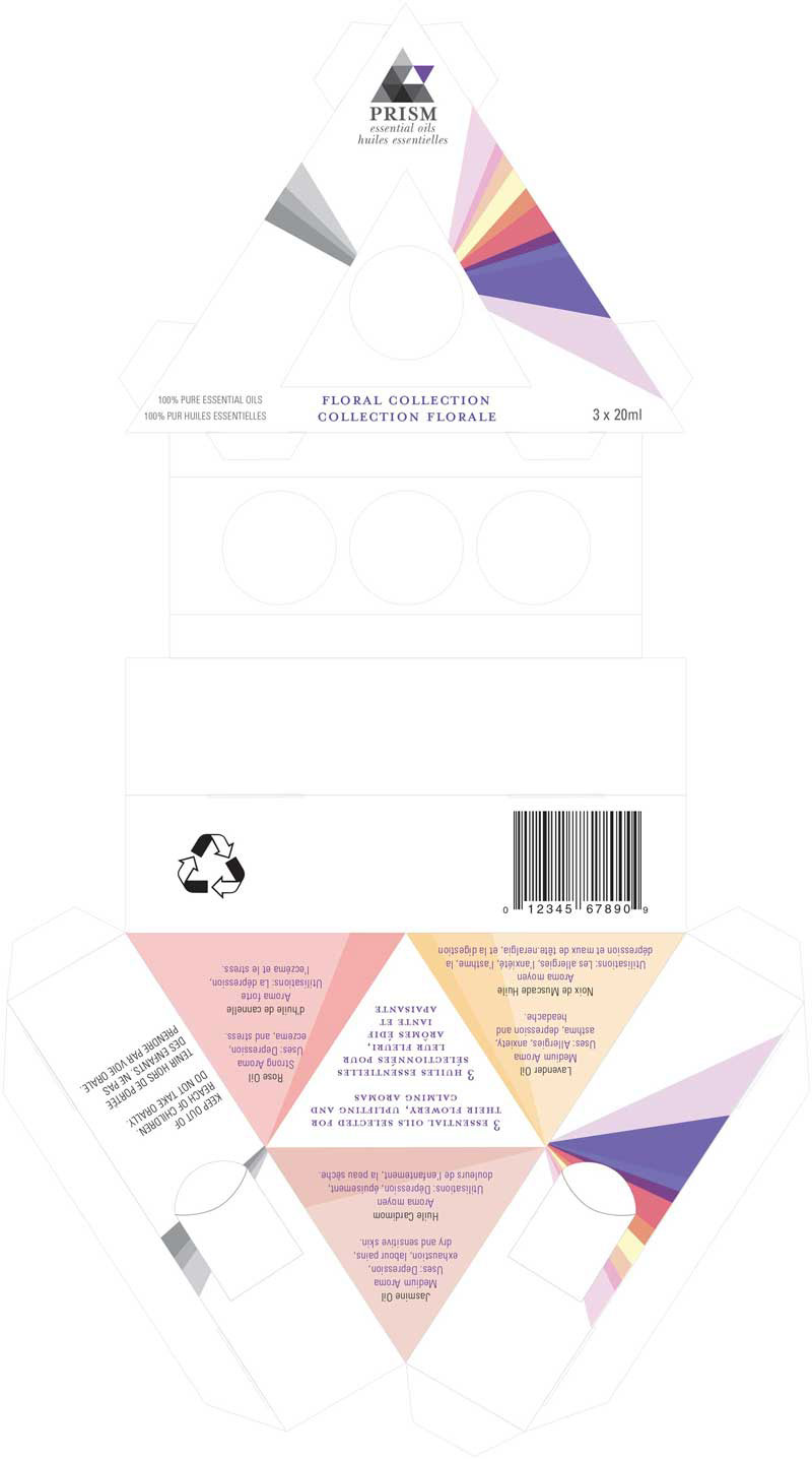
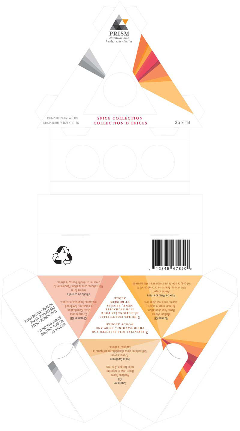
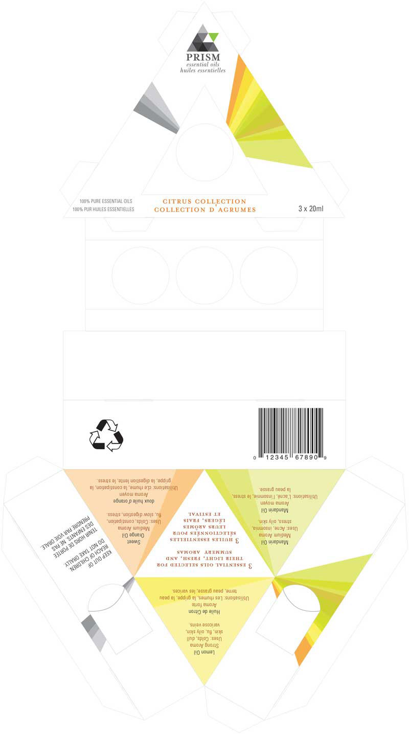
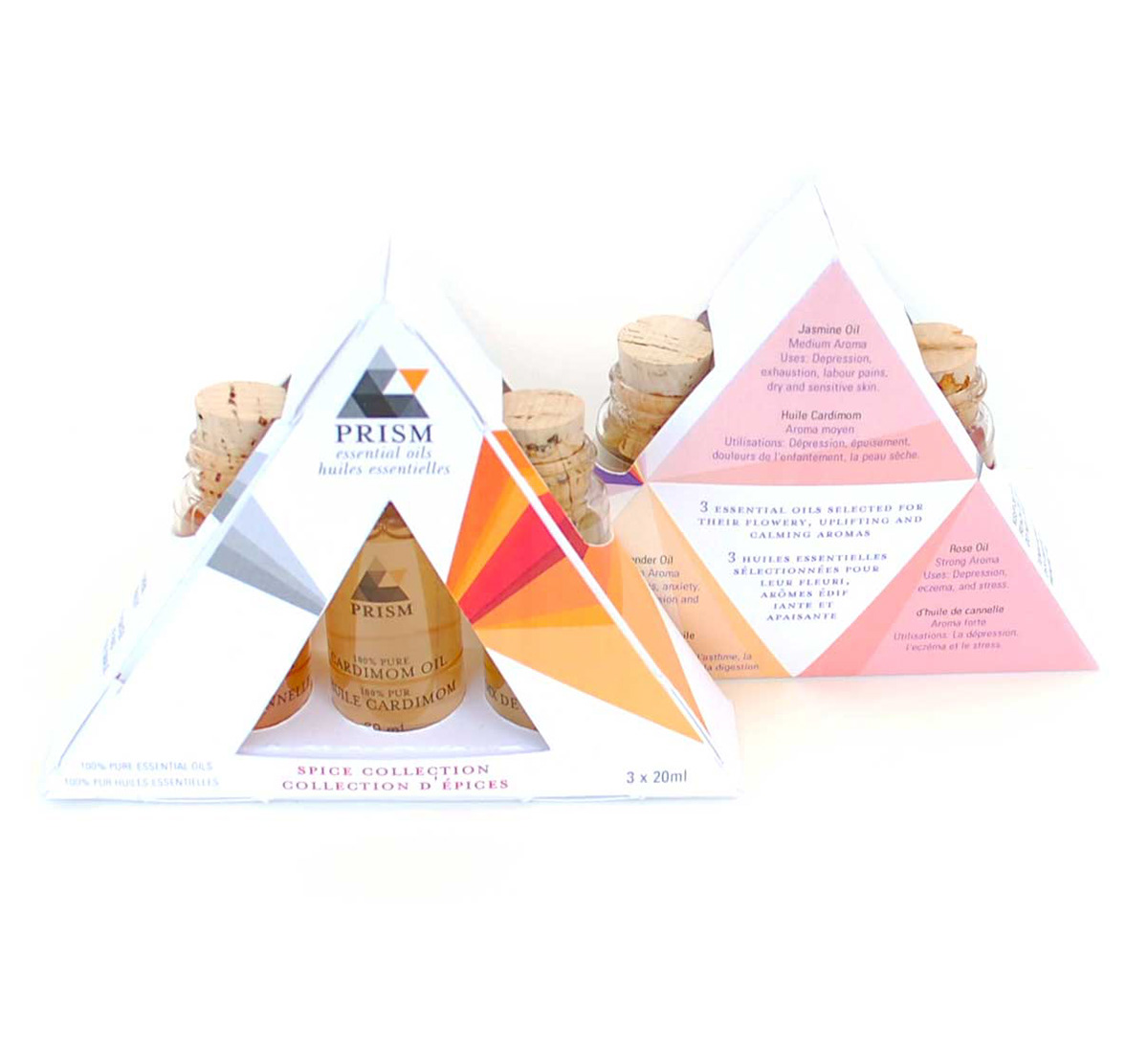
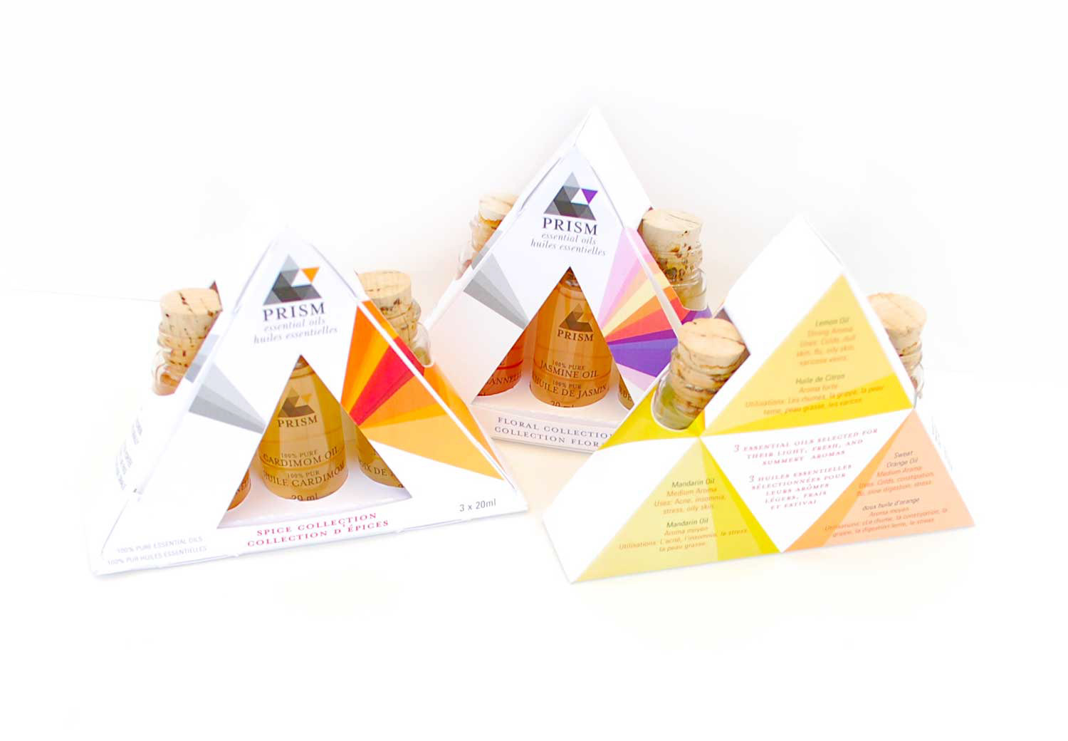
Based on the prism metaphor, I designed a brand identity and three spectrum packages each with a different flavour profile; spicy, floral, and citrus.
These spectrum packs are a way for new consumers to explore different aromas and flavours. The essential oil packs are conveniently arranged in a way that consumers may try both the mild and strong aromas of each flavour.
I designed the package to include a description of the flavours and of their uses, shown on the back. Each spectrum package contains three aromas, the back is divided with a description for each aroma, in the middle the flavours meet forming a white prism, to show their combined uses.
The brand is unique in that is offers consumers a way of exploring, experimenting, discovery and having fun trying out different flavours that may suit different moods or occasions. Prism essential oils are about essence and experience.
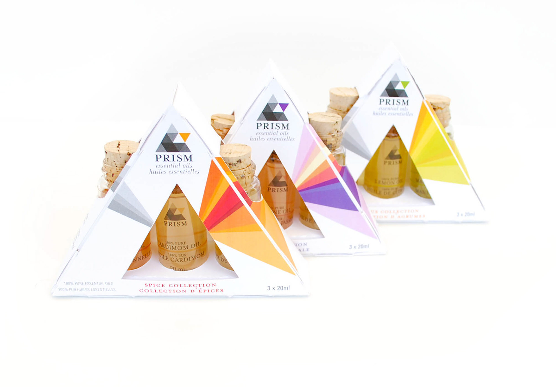
The package itself had to be designed in a way to protect the glass bottles of oil, with the added challenge of using no gule and one single cut dieline. Shown below is the original dieline designed for just this challenge. The design incorporates folding to create cushioned areas for the bottle and tabs to link and hold the package together.
The consumer docent have to destroy this package to open it, the front panel, linked to the body of the package by tabs, can be easily opened and closed for reuse.