

ASHOKA is the Flagship Brand of ADT (International Food Manufacturer) and one of the widest distributed ethnic Indian brands in the world. With that being said, the brand has little exposure outside of traditional Indian supermarkets. With a global rise in cross-cultural cuisine, this is a golden opportunity to grow the brand.
This concept project was an evolution of the ASHOKA brand to target a wider, more mainstream demographic, and as a result, to refresh the brand as a whole. This refresh will include an evolution of the identity mark, visual identity, brand positioning and packaging design of its products, beginning with the Ashoka Authentic Indian Pickles.
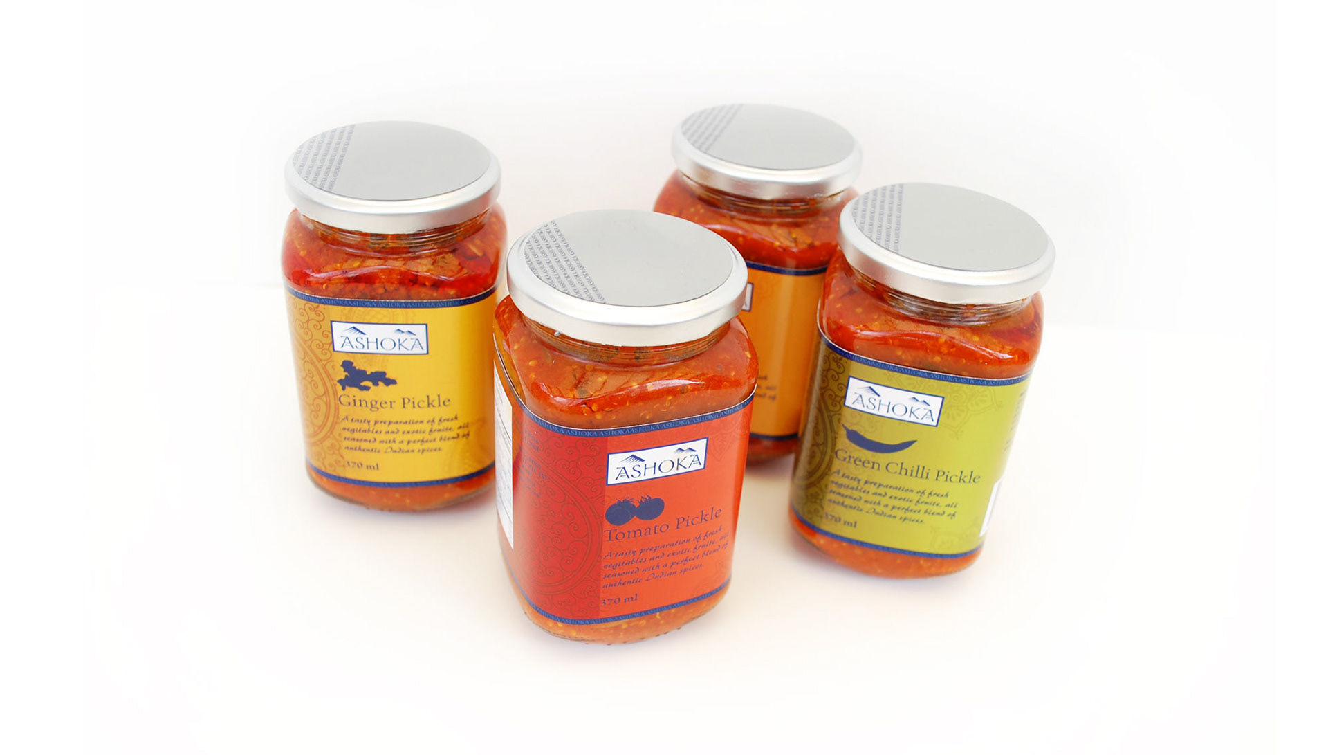
The four most popular pickle flavours were chosen to showcase the evolved ASHOKA brand.
The evolved brand identity was a balance between modern aesthetics paired with traditional Indian design elements.
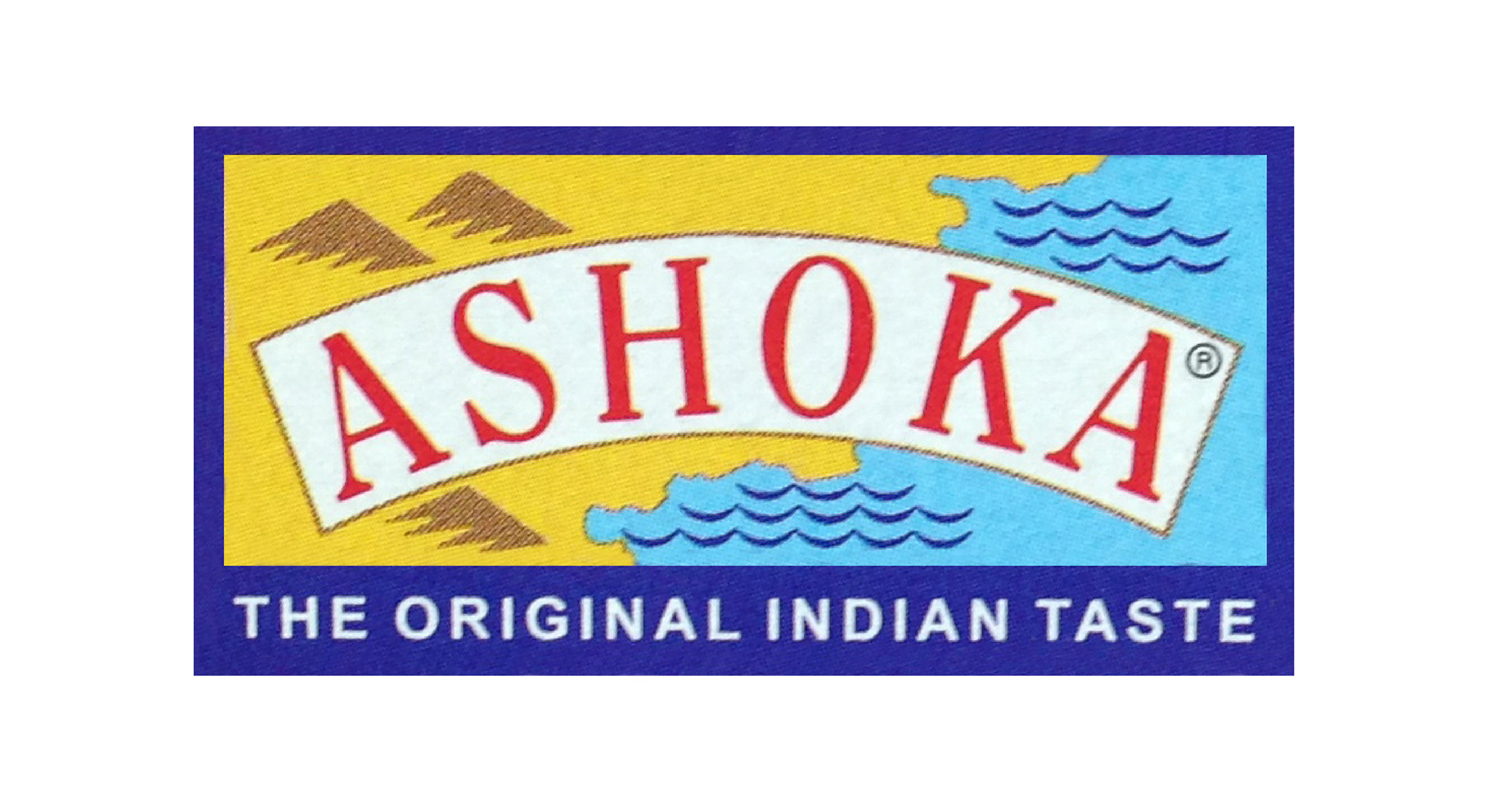

The brand identity mark was evolved keeping the same blue borders and some pictorial elements but modernized and tailored back for sophistication. The typeface was changed to bring in the cultural nuisances and feeling of authenticity. The mark was striped down to one colour, as it would be implimented across a wide line of products of various colours and designs.
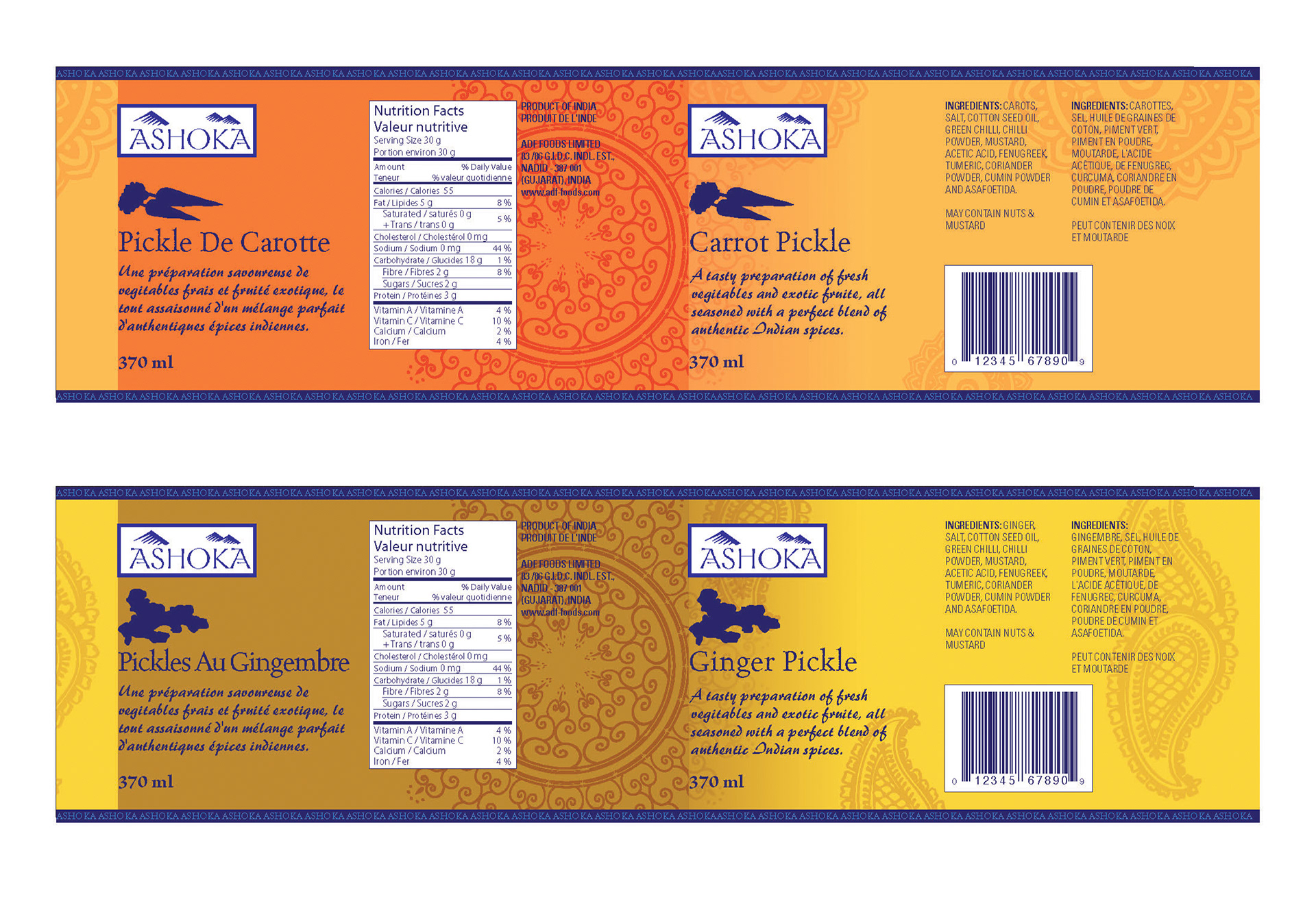
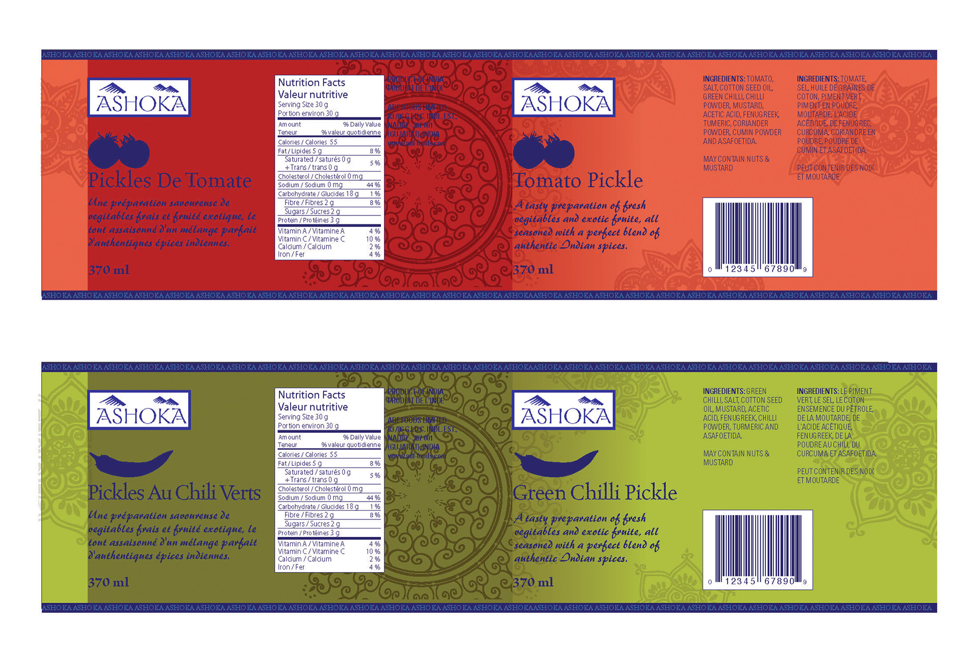
Shown here are the graphic labels
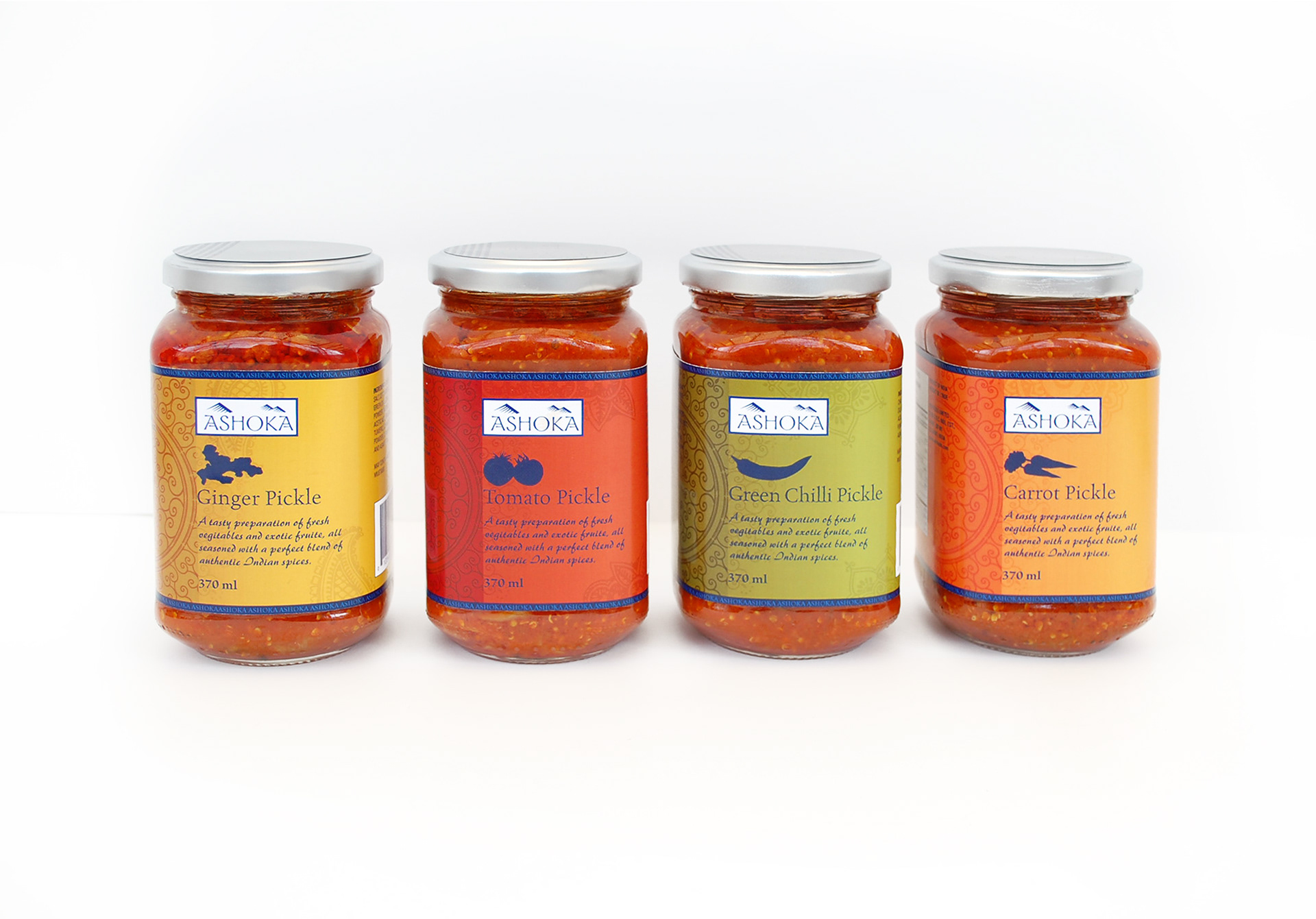
The competitors in this category tend to use photographic pictures of the flavour and a centred more traditional layout. For ASHOKA a more modern approach was taken, with an asymmetrical layout and graphic approach to the images of the flavours.
Each flavour given its very own punch of colour, making them easy to distinguish from eachother. To unify the visual identity the "ASHOKA blue" was used for all text, and as a border detail to unify the designs.