Allard Audiology is a hearing aid and hearing test clinic, which provides additional services such as hearing loss rehabilitation and diagnosing auditory related conditions.
 The goal was to refresh the brand identity and evolve the identity mark. I also wanted to bring in some graphic elements to further showcase what the clinic specialized in.
Business card mockup for Allard Audiology. Card design uses deep blue bans to frame the card while a blue accent divides the contact information.

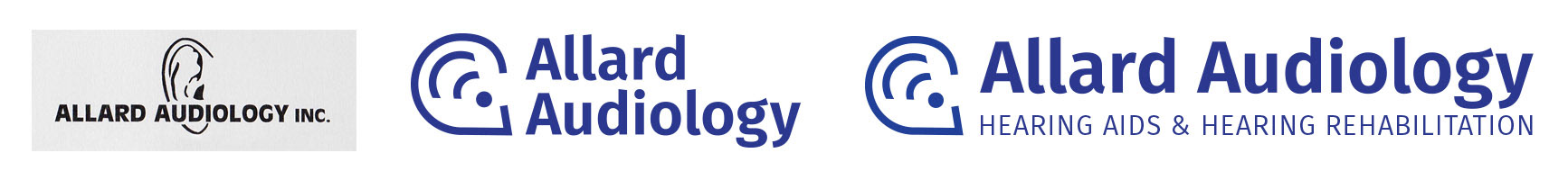
The re-designed identity mark incorporated graphic elements to show the specialization of the clinic. The ear icon doubled as a speech bubble, while the sound waves doubled as a hearing aid. The updated identity mark addressed the scalability issue of the original mark, now working at both large and small scale applications.

Two variations of the mark were created; one short and one long with the tagline. 


The business card employed clear hierarchy from identity mark, to the contact information then to audiology clinic owner/specialist. All text needed to be kept large and bold for an aging clientele. Keeping it clean and straightforward were key to fulfilling the needs of clinic and its clientele. The use of the sonar lines as background was made apart of the brand identity and employed as a background.

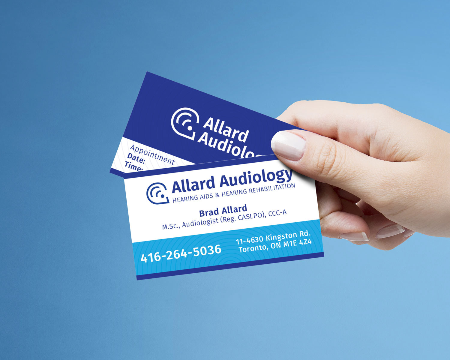
The referral pad is meant for doctor use, where a general physician would refer a patient to Allard Audiology for assessment. These pads a printed in large quantities to be distributed to multiple doctors offices across the GTA to gain referrals. It is important for printing and costs to keep the referral design in one colour, however it is imperative that the brand identity still be strong. Stronger brand identity in doctors offices generats brand familiarity and differentiates Allard Audiology from competitors. 

The final pieces created where the store-front signage.
Back to Top